The Romance and Thrill. . . or the guilty pleasure of building Warm and Cool Gray!
When graphic artist Annabella Silver began to design a magazine, she encountered Warm Gray and Cool Gray color swatches that were beautiful, inspiring, yet intimidating. Thrilled by their subtlety, she began to color gradients, text, and backgrounds with those grays. Then she hesitated. For all their appeal, those swatches were tormented by inconsistency. Unable to resist, she decided to use them anyway—but on her own terms.
If you want gray—gray text, gray backgrounds, gray gradients—you’re almost always better off using a percentage of black rather than one of the 11 Cool Gray or 11 Warm Gray color swatches.
Why? Because Cool Grays and Warm Grays contain very little—or no— black. When gray is built of cyan, magenta, and yellow, the color depends on every pixel of those 3 plates landing in the exact same spot. If the pixels shift even a tiny bit, the color isn’t going to be consistent. It could look a little more cyan in some places, pinkish in others, and yellowish somewhere else. Gray that’s made of a percentage of black is very stable because all the color comes from the black plate.
If you really want a Warm Gray or a Cool Gray look, don’t despair! It just takes a little bit of time and experimentation. Look at the color boxes on the right. Can you see a difference? Maybe, maybe not. Look at the ink percentages. Although they all use 3 of the 4 process colors, the “Better Than” versions will be much more consistent because the base of the gray is coming from the black plate. There’s just enough of the other process colors to give the swatches a warm or cool look. 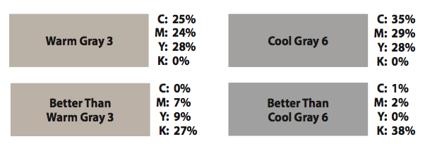
How do you find a better build? Open a new CMYK Photoshop file. Set the foreground color to the CMYK build of the Warm or Cool Gray you wish to simulate. Cool Gray 6, for example, is C: 35%; M: 29%; Y: 28%; K: 0%. Marquee an area and fill it with the foreground color. Change the document color mode to grayscale and eyedropper the area. Use this percentage of black as your starting point for the new mix. For Cool Gray 6, it’s 41%. Delete the gray box.
Change your file back to CMYK. Recreate the first foreground color you built. Marquee and fill a new area. Now click on that foreground box again. Start trying different combinations in the CMYK fields, with the base being the percentage of black you sampled. As you tweak, you can compare your new build to the original in the small area at the top of the window that says new and current. Limit the new build to black and 1 or 2 other colors. Once you’ve added in a little of the other colors, you will probably have to adjust your black percentage slightly.
And there you have it! A Warm or Cool Gray that prints consistently!
Finding better ways to create the 22 Shades of Gray wasn’t easy, and it posed challenges that Annabella couldn’t anticipate. But she found better builds that didn’t sacrifice the integrity of the grays as she wrestled with those color demons and finally broke free of their tormented past!
If you still have questions on perfecting the warm and cool gray colors, please contact us!
