Standard Black vs. Rich Black
OR: What do you mean, black that’s blacker than black? Huh?
There’s no doubt about it, printing can be confusing. Take black ink for instance. What could be easier or more straightforward? You use the default black color swatch and you’re good to go…right? The answer is a definite maybe.
Let’s shed some light on the different blacks and their applications.
100% Black Only:
100% black only should be used for text in almost all cases, like the article you’re reading now. Black text that’s built using 2 or more colors will not look crisp and it’s next to impossible to register consistently.
The only time we don’t require text to be changed to 100% black only is when it’s used in ads. We realize our customers have little or no control over the advertising they’re provided. 100% black should also be used for rules, black graphics and grayscale photos. RGB or CMYK grayscale photos will look muddy when they’re printed.
2-Color Rich Black:
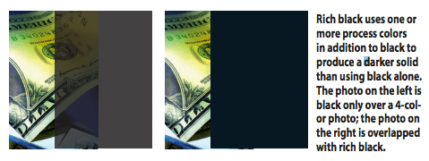
This is 30% cyan and 100% black and is generally used for backgrounds. The cyan boosts the density of the black and makes it less likely that the black will appear blotchy when printed, especially over larger areas. It’s also a good choice if parts of the black background will overlap a 4-color photo because it prevents the photo from showing through the black. (See illustration.)
This should never be used for text or rules, again because it’s difficult to register.
You can reverse text out of this without a lot of problems as long as it’s fairly large (at least 10 point) and a medium to bold sans serif font. Serif fonts don’t reverse well; they have a tendency to look pinched off or filled in, especially at smaller sizes. Thin or Light typefaces should never be reversed.
4-Color Rich Black (sometimes referred to as “blacker than black.”)
This is composed of: C:40%; M:30%; Y:30%; K:100%. Again, generally used for backgrounds where a deep black is a must. This should never be used for text, rules or black photos. The same rules about reversing text out of a 2-color black apply here with an added caution: you’re now reversing out of four plates rather than two. Even a tiny amount of misregistration may be noticeable and
cause the type to look filled in.
As always, if you have questions about your specific project, please feel free to contact us.
