Back Up the Bus on White Copy
OR: Hey, what happened to my serifs?
If you’re looking for visual impact, let’s be honest: white text reversed out of a colored background can certainly deliver.
Like all good printing-related things, it’s most effective when we understand the potential as well as the limitations.
First, let’s state the obvious: white text isn’t actually white ink. While it’s true that white and near-white inks do exist, for the purposes of this article, we’re going to pretend they don’t. White text is actually the absence of ink.
In Quark, the swatch is called “white.” InDesign calls the swatch “paper.” Regardless of which page layout program you use, coloring text with either of these will result in white copy that is created by eliminating all the ink in the shape of the text. This seems like pretty simple stuff, but here’s where understanding the printing process can really come into play.
Reverse Text Rules of Thumb
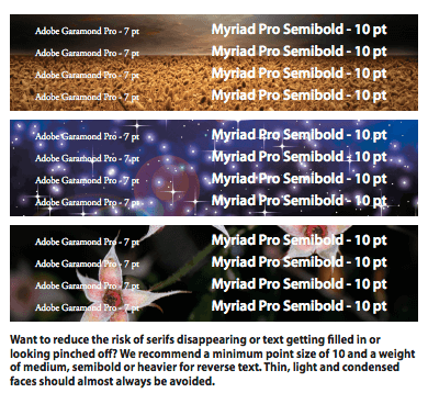
Let’s say you want to reverse your copy out of a photo. Photos are created using all 4 process colors. This means even the tiniest bit of misregistration could result in the text filling in a little, or having a hint of one of the process colors in the white area. The best way to minimize this issue is to make the text large enough and heavy enough that the copy will still be readable if this happens. Sans serif fonts work best since serifs are so small they can pinch off just from dot gain.
Another way to improve readability is to choose the placement of the text carefully. The more uniform the area is behind the copy, the easier it will be to read. Areas with a wide range of darks and lights will make the copy more difficult to see.
If you have questions about designing with reverse text or need help with a specific project, please contact us!
Want more information like this delivered to your inbox? Sign up for our email list!
Error: Contact form not found.
