Articles

PREPRESS TWO CENTS: Obey Your Master of Pages

The Master of Pages is pulling your strings! (Is this going to twist my mind or smash my dreams?) The answer to that question is obviously no since Master Pages are beautiful things when used correctly. Specifically, we’re going to cover how to set up a master page so that your page numbers and slug [...]

PREPRESS TWO CENTS: Obey Your Master of Pages2019-12-23T13:32:29-06:00

PREPRESS TWO CENTS: 22 Shades Better

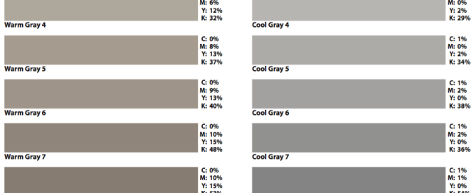
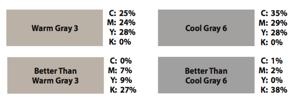
The stunning sequel or possibly prequel. If you’ve decided to enter the mysterious world of Warm and Cool Gray, then this handy-dandy little chart will be your guide. Our previous article, 22 Shades of Gray, explained the consistency issues that plague these colors during printing. We also suggested that you experiment to find better builds [...]

PREPRESS TWO CENTS: 22 Shades Better2022-07-14T15:07:58-05:00

PREPRESS TWO CENTS: 22 Shades of Gray

The Romance and Thrill. . . or the guilty pleasure of building Warm and Cool Gray! When graphic artist Annabella Silver began to design a magazine, she encountered Warm Gray and Cool Gray color swatches that were beautiful, inspiring, yet intimidating. Thrilled by their subtlety, she began to color gradients, text, and backgrounds with those [...]

PREPRESS TWO CENTS: 22 Shades of Gray2019-12-23T13:32:29-06:00

PREPRESS TWO CENTS: Double, Double, Toil and Trouble!

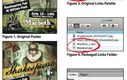
Since when does Shakespeare have tips for naming images? While the Bard was many things—author, playwright, poet—as far as we know, he wasn’t a graphic designer. But we think the witches of Macbeth were onto something when they warned of Double Trouble. How so? What happens if you accidentally use two images with the exact [...]

PREPRESS TWO CENTS: Double, Double, Toil and Trouble!2019-12-23T13:32:29-06:00

PREPRESS TWO CENTS: Proofing and Preflighting

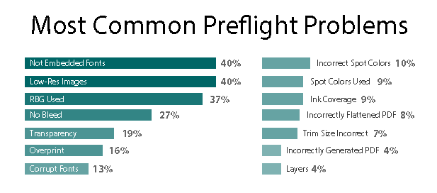
Are These The Same Thing, OR: Who Checks What? Sometimes, when we have a job in-house for printing, questions arise about proofing and preflighting. Are these the same thing? Does the printer “proofread” customer-supplied files? What, exactly, is checked during preflight? Let’s tackle the questions one-by-one. First, proofing and preflighting are NOT the same process. [...]

PREPRESS TWO CENTS: Proofing and Preflighting2019-12-23T13:32:29-06:00

PREPRESS TWO CENTS: Raster vs. Vector

Pixels and Paths and Problems, Oh My! OR: This hurts my brain. Does it really matter? Has this ever happened to you? You’re asked to create a poster. You’re given a logo. It’s a 2" x 2", 72 dpi jpg. You put it on the poster. You enlarge it to 500%. You get your proof from the [...]

PREPRESS TWO CENTS: Raster vs. Vector2019-12-23T13:32:29-06:00

PREPRESS TWO CENTS: Web Printing

And They All Printed Happily Ever After Once upon a time…there was a Happy nBusiness that lived in a prosperous kingdom. At first the Happy Business only needed a few catalogs once or twice a year. As it grew, the Happy Business needed more and more catalogs. This was great except for the cost of printing more catalogs. What to [...]

PREPRESS TWO CENTS: Web Printing2022-07-14T15:08:39-05:00

PREPRESS TWO CENTS: The Registration Swatch

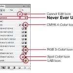
What it is and Why You Should Avoid it! OR: What do you mean avoid it? Isn’t it a super-cool, rich-black substitute? Ah, the mysterious registration swatch, designed for manually drawing crop marks. How often do you do that? Seldom? Never? Certainly there are some legitimate uses for this swatch. However, in our corner of the printing [...]

PREPRESS TWO CENTS: The Registration Swatch2022-07-14T15:08:43-05:00

PREPRESS TWO CENTS: RGB vs. CMYK COLOR MODE

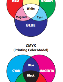
What Difference Does it Make? OR: Why can’t I print the brighter RGB colors? It happened again: you sent your job to the printer, and the preflight report you received says you have some RGB images. What’s the big deal? One color mode is pretty much like the other, right? Wrong. Let’s look briefly at color models. No device [...]

PREPRESS TWO CENTS: RGB vs. CMYK COLOR MODE2022-07-14T15:08:47-05:00

PREPRESS TWO CENTS: Reverse Text

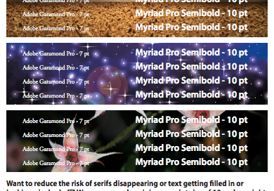
Back Up the Bus on White Copy OR: Hey, what happened to my serifs? If you’re looking for visual impact, let’s be honest: white text reversed out of a colored background can certainly deliver. Like all good printing-related things, it’s most effective when we understand the potential as well as the limitations. First, let’s state the obvious: [...]

PREPRESS TWO CENTS: Reverse Text2019-12-23T13:32:29-06:00
Go to Top