Articles

PREPRESS TWO CENTS: Crossing the Border Margins

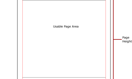
No Passport Necessary OR: what’s so important about margins and image area anyway? Hmmm…the magazine you’re designing has gotten a little copy heavy and you’ve already made the text as small as you think you can without affecting readability. But you need to squeeze in a little more text. Here’s an idea: make the margins [...]

PREPRESS TWO CENTS: Crossing the Border Margins2022-07-14T15:09:11-05:00

HOW TO BUILD AN AD THAT ROCKS! (Or at least rolls with the punches)

Monday morning, 8:00 am Salesperson: “We’re going to put an ad in the local tourism magazine. I want you to build one.” You: “Sounds great! What are the specs for the ad?” Salesperson: “We’re going to go with a half-page advertisement.” You: “Super. Horizontal or vertical and what are the dimensions for that?” Salesperson: “Well…half a page. Probably [...]

HOW TO BUILD AN AD THAT ROCKS! (Or at least rolls with the punches)2019-12-23T13:32:32-06:00

PREPRESS TWO CENTS: Crop Marks

The Magic and the Mystery OR: Did you mean crop circles? I thought this was about printing. The truth is that crop circles are crop marks. Okay, not really. Got your attention, though, didn’t it? Now that you’re on the edge of your seat, let’s take an in-depth look at crop marks and their placement. You’re [...]

PREPRESS TWO CENTS: Crop Marks2019-12-23T13:32:32-06:00

PREPRESS TWO CENTS: Changing Channels

Fixing that Pesky 4-Color Black Text in Photoshop OR: I hope this is still about printing because I don’t have a tv at work Relax, this has nothing to do with TVs or channel surfing. We’re still talking about printing. Specifically, black text that’s made up of two or more process colors instead of just [...]

PREPRESS TWO CENTS: Changing Channels2019-12-23T13:32:32-06:00

PREPRESS TWO CENTS: Back to Black

Standard Black vs. Rich Black OR: What do you mean, black that’s blacker than black? Huh? There’s no doubt about it, printing can be confusing. Take black ink for instance. What could be easier or more straightforward? You use the default black color swatch and you’re good to go…right? The answer is a definite maybe. Let’s shed some [...]

PREPRESS TWO CENTS: Back to Black2019-12-23T13:32:32-06:00

PREPRESS TWO CENTS: Actual Resolution vs. Effective Resolution

Understanding the Difference without Using the Nasty Math OR: My Photos are all 300 dpi; why do some look so bad? In a perfect world, we would always scan our photos or take our photos at 300 dpi and use our photos at 100%. In the real world, though, we’re often forced to scale our [...]

PREPRESS TWO CENTS: Actual Resolution vs. Effective Resolution2019-12-23T13:32:32-06:00
Go to Top