Prepress Two Cents

PREPRESS TWO CENTS: Improving Image Resolution 

Not Like Keeping a New Year’s Resolution OR: Can high image resolution be counterfeited? You sent your job to the printer, and the preflight report you received says you have some low-res images. What could be the harm in opening those photos and punching in a higher resolution in the Image Size window? That should fix the problem, [...]

PREPRESS TWO CENTS: Improving Image Resolution 2022-07-14T15:08:55-05:00

PREPRESS TWO CENTS: Heavy Metal

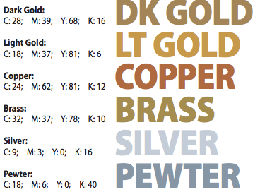
How to Create a Metallic Look without Metallic Ink OR: Adding some bling bling without the cha-ching ching! Oh, those lovely metallic inks, adding their shiny, attention-getting glitz, glamour and class to printed pieces all around the world. Sigh… Too bad it’s just not in the budget. Too bad the metallics are spot color inks. Too bad there’s [...]

PREPRESS TWO CENTS: Heavy Metal2022-07-14T15:08:59-05:00

PREPRESS TWO CENTS: Problems of Four Color Gray

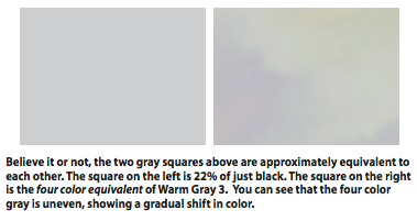
The Anatomy of Gray OR: Why doesn’t my four color gray look…gray? Here’s how the dictionary defines it: gray n 1: a color between white and black; having a neutral hue. The current Pantone color library available in InDesign offers 11 different cool grays and 11 different warm grays. And that doesn’t include all the other versions [...]

PREPRESS TWO CENTS: Problems of Four Color Gray2019-12-23T13:32:31-06:00

PREPRESS TWO CENTS: Digital Image File Types

What’s Up With the Alphabet Soup? OR: Why can’t I just save everything as a jpg? We are living in an acronym world and I am an acronym…okay, skip that. Let’s just say if you’re working with digital images, you better know your acronyms and your alphabet. TIF, EPS, JPG, GIF, PSD, PDF; the list [...]

PREPRESS TWO CENTS: Digital Image File Types2022-07-14T15:09:07-05:00

PREPRESS TWO CENTS: Crossing the Border Margins

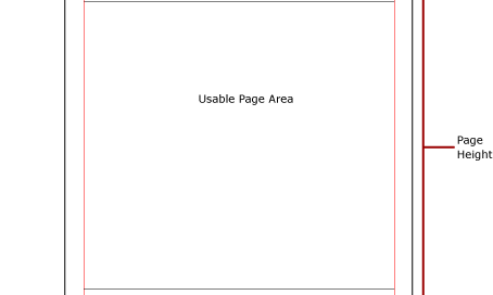
No Passport Necessary OR: what’s so important about margins and image area anyway? Hmmm…the magazine you’re designing has gotten a little copy heavy and you’ve already made the text as small as you think you can without affecting readability. But you need to squeeze in a little more text. Here’s an idea: make the margins [...]

PREPRESS TWO CENTS: Crossing the Border Margins2022-07-14T15:09:11-05:00

HOW TO BUILD AN AD THAT ROCKS! (Or at least rolls with the punches)

Monday morning, 8:00 am Salesperson: “We’re going to put an ad in the local tourism magazine. I want you to build one.” You: “Sounds great! What are the specs for the ad?” Salesperson: “We’re going to go with a half-page advertisement.” You: “Super. Horizontal or vertical and what are the dimensions for that?” Salesperson: “Well…half a page. Probably [...]

HOW TO BUILD AN AD THAT ROCKS! (Or at least rolls with the punches)2019-12-23T13:32:32-06:00

PREPRESS TWO CENTS: Crop Marks

The Magic and the Mystery OR: Did you mean crop circles? I thought this was about printing. The truth is that crop circles are crop marks. Okay, not really. Got your attention, though, didn’t it? Now that you’re on the edge of your seat, let’s take an in-depth look at crop marks and their placement. You’re [...]

PREPRESS TWO CENTS: Crop Marks2019-12-23T13:32:32-06:00

PREPRESS TWO CENTS: Changing Channels

Fixing that Pesky 4-Color Black Text in Photoshop OR: I hope this is still about printing because I don’t have a tv at work Relax, this has nothing to do with TVs or channel surfing. We’re still talking about printing. Specifically, black text that’s made up of two or more process colors instead of just [...]

PREPRESS TWO CENTS: Changing Channels2019-12-23T13:32:32-06:00
Go to Top